BI visualizations
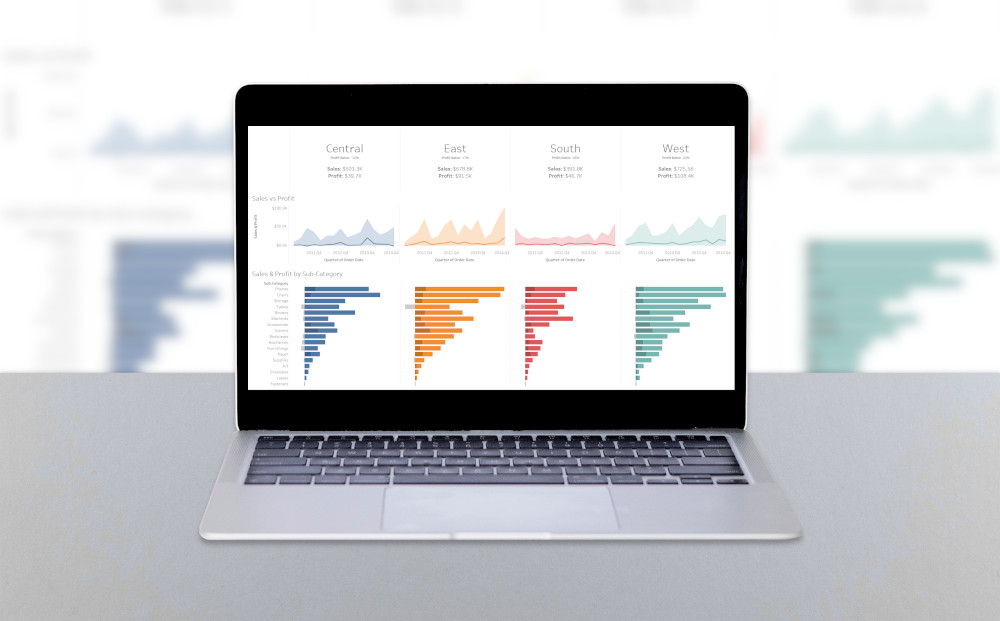
Tableau visualization realization focused on overview dashboard design, analytical hierarchy, and fast interpretation of key performance patterns across a compact reporting surface.
Scope
The dashboard applies layout discipline, visual grouping, consistent chart language, and clear comparison patterns to support quick orientation before deeper analysis.
Outcome
The result demonstrates how Tableau can be used to convert fragmented metrics into an overview layer that is readable, balanced, and suitable for executive-style analytical review.
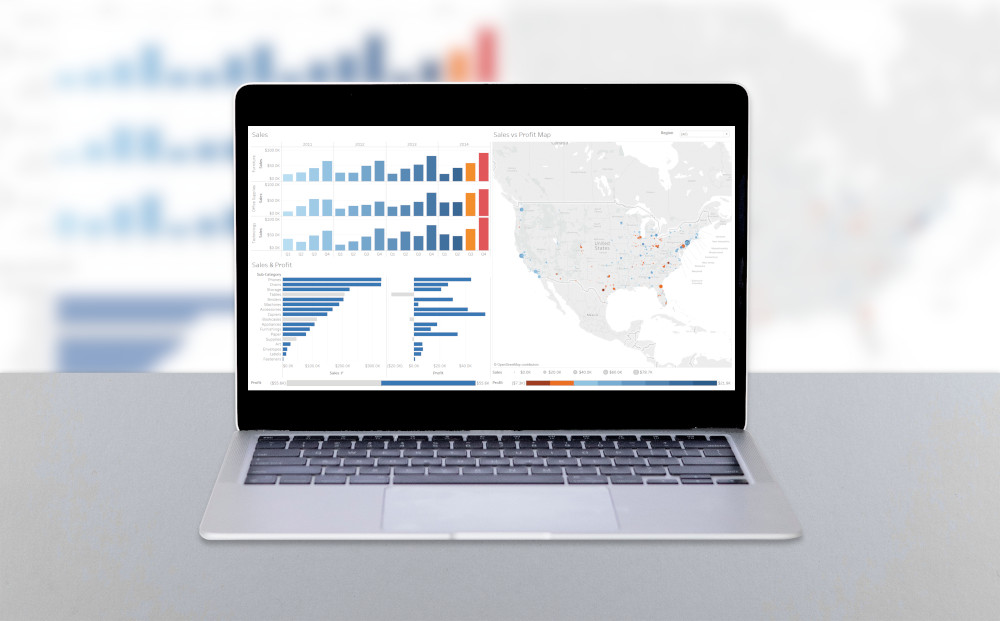
Tableau visualization realization focused on detailed analytical views, drill-down interpretation, and precise presentation of supporting metrics behind the higher-level dashboard overview.
Scope
The view emphasizes structured comparison, readable chart density, and separation of context from detail. It is designed to help users inspect individual patterns without losing analytical orientation.
Outcome
The result shows a more detailed reporting layer that complements an overview dashboard and supports deeper investigation of trends, distributions, and operational differences.